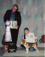
This blog is used for the purpose of keeping everyone up to date on what is happening in the Faw universe. It will range from portfolio pieces to what is up with the Beagles and the Portuguse Podengo Pequeno thay we raise and show.
Not too bad, although I'm not sure if I like how the navigation is split into two columns. I feel like it's a little cluttered too. Remember, this is a website, so you have a lot more room to play with.
I agree with Jameal. It's a bit cluttered and hard to see where you want the view to look first, second, third, etc. Make sure you check out techniques that other sites are using and bring those into your own design.
Although, on all of your designs, you made a HUGE improvement from the first versions you showed us in class. That's big step. From here it's a tweaking. Nice work!
I liked something in all three of these. I think this one is my favorite though. I think it might have been cool if you could have made the background like a blue color like your inspiration. But you got the big moon thing down. I also have all three movies of underworld..love them.
I am a 39 year old who had never dreamed of being back in school again at this stage in my life. I was an industrial electrician by trade until I had some health issues and can no longer be around the electromatic fields that I used to work around, so I had to choose a new direction for my life.


Not too bad, although I'm not sure if I like how the navigation is split into two columns. I feel like it's a little cluttered too. Remember, this is a website, so you have a lot more room to play with.
ReplyDeleteI really like what you did with their logo!
I agree with Jameal. It's a bit cluttered and hard to see where you want the view to look first, second, third, etc. Make sure you check out techniques that other sites are using and bring those into your own design.
ReplyDeleteAlthough, on all of your designs, you made a HUGE improvement from the first versions you showed us in class. That's big step. From here it's a tweaking. Nice work!
I liked something in all three of these.
ReplyDeleteI think this one is my favorite though.
I think it might have been cool if you could have made the background like a blue color like your inspiration.
But you got the big moon thing down.
I also have all three movies of underworld..love them.